When you need to decide whether workload is growing, who handles the most interventions, or whether the mix of jobs is shifting, gut feeling is not enough. If you have to piece together numbers from protocols, clients, and other views, it takes time and decisions come too late.
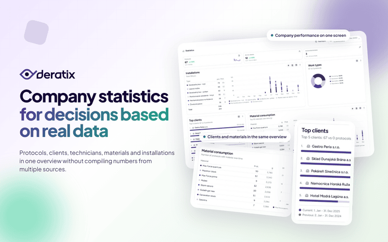
Dashboard statistics bring all this information into one place. First, they show a high-level picture of company performance. Then you can drill down into clients, technicians, materials, and installations. The result is simple: fewer guesses and more confidence when planning.
See whether workload is growing or shrinking — on a single screen
The foundation of the statistics consists of three numbers that matter most for day-to-day management:
- number of protocols for the selected period,
- number of active clients,
- number of active technicians.
A number on its own does not say much. What matters is that you can choose a period and compare it with the previous period or the same period last year. In practice, you quickly find out whether you are looking at steady growth, a short spike, or the first sign that something is slowing down.
This is especially useful when decisions need to be made fast. In the morning, at the start of the week, or before a meeting, you do not need to browse through multiple sections. A glance at the dashboard tells you whether the company is heading in the right direction.

Instantly see where most of the work comes from
The protocol count is important, but it is not enough on its own. You also need to know which clients are behind it and how the workload is distributed among technicians.
That is why the dashboard also shows top clients and technician performance. This makes it easy to spot whether the company relies on a broad portfolio of customers or just a few large clients. Likewise, you can immediately see whether the workload is evenly distributed or piling up on a handful of people over the long term.
This is exactly the kind of information that helps when planning field visits, capacity, and client communication — not because the dashboard makes decisions for you, but because it shortens the path to what needs attention.


It is no longer just about intervention counts — materials and installations matter too
Later, the statistics were expanded to include a view of materials and installations. This is important because you no longer see just how many interventions were added, but also what is really behind them.
For materials, you can review:
- which products are used most often,
- how their consumption changes over time,
- and whether you are more interested in quantity or the number of protocols in which a given material appeared.
The same applies to installations. The dashboard shows which equipment types appear most frequently and how their share changes over time. This kind of insight is useful for stock planning, consumption monitoring, and getting a better sense of what type of work currently prevails in the company.


A typical real-world scenario
At the beginning of the month, you need a quick snapshot of what has changed. Knowing that there was more work is not enough. You need to know whether new clients came in, whether the number of interventions increased, whether material consumption shifted, and whether some technicians have been overloaded for an extended period.
This is exactly where statistics make sense. You do not have to open protocol history, the client list, and other views separately. On the dashboard, you select a period, compare it with the previous one, and within minutes you know what is happening in the company.
What matters most
The biggest benefit of dashboard statistics is not that more charts were added. What matters is that the company has numbers in one place that support planning and decision-making.
First you see the high-level performance picture. Then you can break it down — where most work comes from, how it is distributed among technicians, and what is happening with materials and installations. That is the difference between an impression and an overview you can actually act on.
If you want to explore this topic in more detail, check out Statistics and charts, Dashboard, and related updates in the changelog.