Skip to content

Statistics & charts

Instant overview of your company's activity. Protocol counts, active clients, technician performance - all in clear charts. Compare periods and track trends.

Deratix Statistics & charts — desktop application screenshot showing the feature in action
Deratix Statistics & charts — mobile app view with touch-optimized interface

Features

Protocols over time

Chart of protocol counts by days, weeks or months

Top clients

Which clients generate the most work, sorted by protocol count

Technician performance

How many protocols each technician created in the selected period

Period comparison

Current period vs last month or the same period last year

Custom date range

Preset periods or custom from-to selection

Material and installation trends

Most used materials and installation types in a chart

Colors in your design

Entire chart palette generated from your company color

Real-world examples

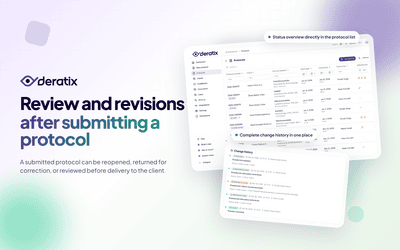
Instant overview of the company

After logging in you can see how the company is doing — how many protocols were created, how many active clients you have, who among the technicians was busiest. All in clear charts that you understand at a glance.

Comparing periods

How are you doing compared to last month? And compared to the same period last year? Select a time range and enable comparison — trends and changes are visible immediately.

Data that helps you make decisions

Find out which clients generate the most work, which intervention types prevail and how work volume changes over time. Useful when planning capacity, evaluating a season or preparing quotes.

  • Charts of protocols over time, work types, top clients
  • Performance of individual technicians
  • Custom date range selection
  • Comparison with previous period or last year

Documentation

Stay in the loop

Be the first to know about updates and improvements.

By subscribing, I agree to email processing for newsletter purposes. I can unsubscribe at any time.